Implement UI Design Using Grapedrop Vol 2 : Create Responsive Design

Hello friends. I am Agung Prabowo from Singaperbangsa Karawang University. This time I will continue discuss about UI Design. we will discuss about User Interface Design and Implementation of User Interface Design. this article continuation of the previous article. Let’s just start the first discussion.
Responsive Design
By default, all Grapedrop blocks are built with a responsive design, so most of them adapt automatically to changes in screen size, but also allow high-level adjustments to the layout so some manual changes are still required. So, remember to always check your designs.
Sharing Style Using Class
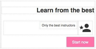
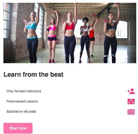
Let’s start by defining a new section structure. First of all, place a new Section Block under the Header and place the Grid in it. Start by removing one of the columns from the Grid so it only has 2 columns. In the left column, enter an Image Box (similar to Image but in this case, the image will dynamically fit the block size) and select an image from the Image Manager. In the right column, drop Header Block (enter text of your choice) and at the bottom place Simple Link.
The result will look similar to this

To introduce you to Class, what we’re going to do now is try to reuse the same style as for the CTA button, in the header, on the Link that was dropped earlier.
You can find the Class Viewer in the right sidebar of the editor, just above the Style Manager properties.

This pane will show you all the Classes applied to the selected block (with multiple selections showing all common classes between the selected blocks). There’s also a dropdown with States (we’ll get to that later) and a “+” (Plus) button to add a class to the selected block.
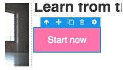
So let’s select the CTA link (from the header section), click the “+” button, write the new Class name and press (Enter). Here’s how the viewer will change.

You can now see the newly created CTA button class, which you can edit by double-clicking on its name or delete it by clicking on its “x” button. Another important element that
added to the viewer is the Sync button, if you see it, it means the selected block has a style that you can transfer to the current Class. Indeed, if you click now on the Sync button, it will disappear and you may also see the state change of the previously changed property (it turns yellow, which means it’s not part of the selected block anymore but inherited from some parent block).

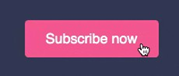
Great, now we have added the CTA style in our class so we can use it in other blocks, so select the Link we added recently (currently without class), click the “+” button, type the same name as the class (the button CTA) and press (Enter), don’t forget to click Sync on the CTA button. This is how you use Classes to share styles.
Now, remember that when you update the style property of a block containing a class, it will only update the selected block, but when you click the Sync button the editor will transfer the style from block to class and all blocks containing that class will update accordingly.
One common design pattern you may see with CTA buttons is how they change their style when you handle them with your mouse pointer (or even clicking on them). This is where countries come in handy, let’s see how they work
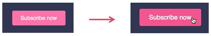
Select one of the CTA buttons, change the State dropdown to Hover and you will see the border change color (this indicates that you are editing with active State). Now we can update the style property, change the Fill color (under Background) to #e16a93 and you’ll see it is applied only to the selected block. You may also notice that the Sync button has appeared again and since we want this effect to apply to all of our CTAs, we need to click on the Sync button. After synchronization, when you’re done styling, remember to go back to the default State.
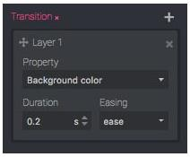
You may notice that the color changes aren’t as pleasant and smooth as you’d expect, this is because we didn’t apply any Transition to the link block. To do so, select the desired CTA (by default), open the Extra category in the Style Manager and add a new Transition layer (Plus icon). Here you specify what type of property you want to turn on (choose one from the list or All if you can’t see the property you want in the list), the duration of the transition in seconds and the ease function to apply. For our needs, we will set the Background color as the property, 0.2 seconds for the duration and the default ease as the easing function.
After applying the changes, remember to Sync your style to apply it to all the CTA buttons. This is the result
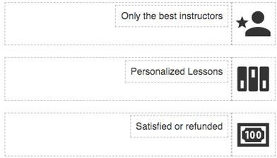
Let’s go back to the section, now we need to write some key features about our product and as before, we will continue to use our famous Basic Blocks. Start by dragging a new Grid block below the Header text, keep only 2 columns, on the right put the Icon (choose the icon of your choice) and on the left put the Text Block. Make the column containing the Icon be Fit Content (in Behavior). Also select the right column containing all the text (header, grid, and links) and set Text Align (under Typography) to Right.
The grid where the Icons and Text are placed will become a feature line and as we want is to create 3 same grids, then select and copy them 2 times (update the copy with new text, new icon)
The point of creating these 3 unstyled feature lines is to show how you can speed up your work by using Multiple Selection. To select multiple blocks, you can start by selecting the first one and then pressing CTRL you can select other blocks individually or, if the blocks are children of the same parent, you. can select the first one (eg the one at the top), press the up arrow and select the last one (eg the one at the bottom), this will also select all the blocks in the middle.
With Multiple Selection enabled, you can arrange your blocks all at once and the same if you want to add/remove Classes.

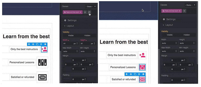
As you can see, we can select the 3 grids, style them, apply a new Class and click the Sync button to transfer the styles from block to Class. It’s the same if we focus on just one block, transfer its style to a Class, and then apply that Class to another block. In this project try clicking the icon on the first grid, resizing the icon to be smaller (here width 41 px and height 41px) and changing the color to #d8507f. Then create a Class feature line icon and sync it. Next select the 2 grids below it and add a Class feature line icon. The result will be as follows.
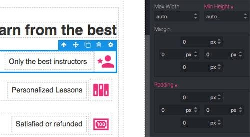
We can reduce the Grid height by removing the padding and setting the Min height to auto.
Since the change is applied to the Grid which has a Class, we synchronize it with that Class. Let’s add a bit of a top margin to the link below (eg 30px) and maybe increase the bottom margin of the heading text (eg 30/40px), to give these features more visibility. In the end, we should see results similar to the following.

Let’s move now to the left side. Since we’re not using a lot of space with the text, we can put more emphasis on the image. So, select Image and give 350px to the height, since we’ve used the Image Box block so don’t really care about sizing it right as it will adjust automatically, so we can set the width on the other columns. Select the right column and make it 400px Max width, maybe it’s also better to set the Vertical Align to the middle.

To finish this section, check the responsiveness of the design on a smaller screen size as we did before (remember that Grid comes in multi-line by default), to get the same effect.
Custom Block
In the last section, we introduced the use of Classes to share styles, then we looked at how to save and reuse custom blocks.
In this section, we will describe the infrastructure available by creating cards for each that contain important information
Let’s start by dragging a new Section on the Canvas and setting a Fill color on the background which will help the user to distinguish it from the previous section (eg #Dde2ed). Now also drop the Header (add any text as the section description) and the Grid which will contain the card. Align center the Header Text (Text Align property in Typography) and set #303a52 to its font color

Now we can start making cards. For starters, we can use a Box block as the main wrapper, this is a simple and common block, but it will be almost the same as using a Box block with only one column. So, put the Box block into one of our columns and style it with these properties:
- Fill color: white
- Border radius: 5px (all corners)
- Box shadow: Offset Y 5px, Blur 10px, Fill color: #bbb
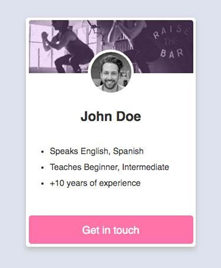
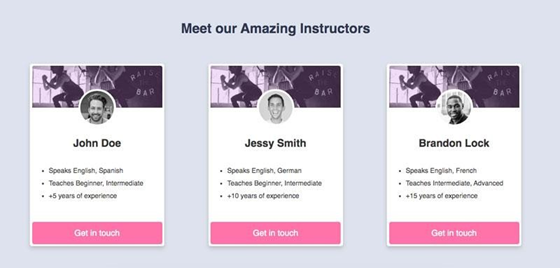
Include in the Card block the following items: Image Box, Grid, Header and Text. Then, on the Grid place an Image Block in the middle column and under Text copy one of our CTAs. This is the result you should see. Use the move icon on the layer for easy adjustment.
For the Image Box select any image you want and set the height to 100px. For Images placed in a Grid, select the instructor’s profile picture (but any image will be fine), set the Border radius to 100% (all corners, this will turn the image into a circle) and the Border to 5px, solid, white (Width, Style, fill color).
Note:
If the image selected for your profile is not square (same width and height) you may see an oval instead of a circle. Unfortunately, manually resizing the image won't help, because you'll get a stretch result, so in this case, we recommend replacing the Image Block with a Box Image (this will avoid stretching the image)
Now, we are going to use one of the margin tricks to increase the image on the grid (profile) column, so select the grid and change its top Margin to -50px, this will bring up not only the grid but also all the blocks below.

To make the image look centered and nice on mobile devices, make all the columns Fit to Content, then center them using Horizontal Align on the Grid and add a fix width to the Image (eg 100px).
In the next step, we can update the Header with the instructor name and the Text block with some information. For styling, center the Header (using the Text align property) and reduce its Font size (eg 25px). Update CTA Text and Width to 100%. Of course you can play more with the styles to make it look better (eg use the same radius border on the top corner of the Draw box to align with the card holder). When the card container tries to get all the available widths, we can limit it by setting its Max Width to around 320px. This is how it looks so far.
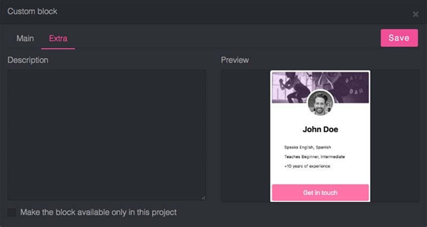
Let’s create now the first Custom block, to bring up the modal custom block, you have to select the block (in this case the card container) and press CTRL + K or just select create block from the settings toolbar.

From the modal, you can see the block code and preview it. If necessary, you can edit the code before saving and see the changes in the preview below.
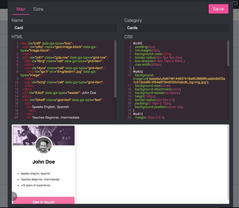
On the Extra tab, you can also add a description, upload another preview by clicking on the preview of the current block, and make the block available only in this project by ticking the bottom line.
Note:
If you update your code and want to recreate the preview screenshot, you can use the actions in the lower left corner of the preview container.
Once saved you will have a new block with the Custom Block category, you can edit it (mouse over the top of the block, click the pencil icon in the lower right corner) and drop it on the Canvas like any other block.

Note:
Blending Custom Blocks with Classes might help you create highly scalable templates.
Now we can drag the Card block on the remaining columns and update its contents. To center it nicely, make the column Fit Content, then change the Horizontal Align on the Grid to Space Between (4th option).
Form
In the next section, we will add a simple subscription form and will see how to check the collected data.
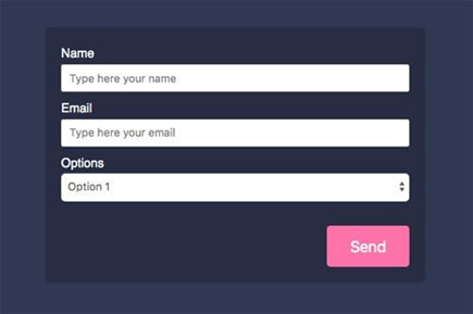
Start by dropping a new Section Block on the Canvas, setting the same Background and Typography colors as the Header section. Inside that section, place a heading block and below that drop a grid with 2 columns. In the left column add Text, on the right drop Form Block (Forms in a sub-category in Basic Block). Modify the text, style it as you wish and update the column sizes to give them more space (eg set the Width Max value to 500px and Align Horizontal on the Grid to Space Between)

Note:
You can drop another Form Block (Input, Select, etc.) in a form (even a blank one is ok)
You may have noticed how the text inside the form is not visible, this happens because the container doesn’t have an explicit color so inherits it from the section. For this case, we will only change the background color from white to rgba(0,0,0,0.2) (which means black with 0.2 opacity).
Remove the Form section containing the Gender and Message, and update the button style by replacing its default class with the cta button (if you see a white border around the button, you can remove it via the Border property). You can also give the Send button more space by updating its padding container (Form Group). This is the result of those settings.
When selecting an input block, you may see different properties under Settings, make them all required, rename Options to Level and update the options list with these values: Beginner, Intermediate, Advanced (one per line).
Note:
Make sure to have input with unique Name property in each form, to avoid overwriting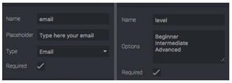
Our input is ready, now we can select the Form and check its properties in Settings.

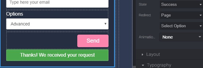
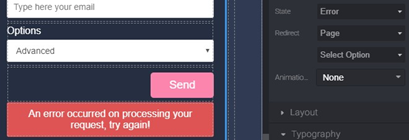
The name is not mandatory for the form but it might be helpful when you are going to check the collected data, so let’s call it Subscription. The method is used to tell the browser how to send data, if you don’t know how to use it, leave it as POST. In Send to you specify the URL where to send the data, to collect data in Grapedrop you have to leave it as is (blank). The State property allows you to customize the message in case of success or an error (e.g. the user lost internet connection) of the submitted form.
The Redirect property allows you to send your users to another page/URL once they have successfully submitted the form. For now it can be left at the default value.
To test your form, click on the Preview button (eye icon) which will open your page in a new tab, fill out the form and hit Send. Now you can go back to the editor and check the data. To see all the data collected, open Page Settings from the Pages panel (mouse over the top of the page layer and click the gear icon) and go to the Forms tab.
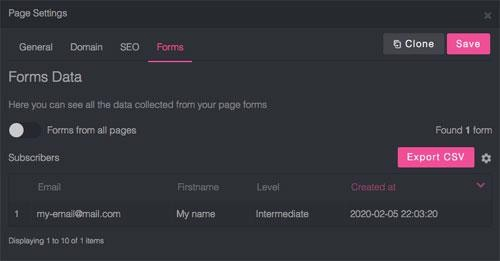
Here you will be able to see all the data that the landing page will collect, export the data (at least subscribe to the Basic Plan), and perform other common operations to manage the data (click the Gear button on the top right).
Conclusion
In this article, we discuss more about how to create responsive designs using Grapedrop. our next discussion is how we share or publish the results of our designs to the internet.

